
Shatter Impressionism
A New and Unique Way to Paint
What is Shatter Impressionism?
Fractured Vision
For years, I visited the galleries in Park City. This has always been a Mecca for amazing artist's work. Like most galleries in the 90's and 00's it still held that strong traditional cowboy vibe. But around 2015 I noticed a change in the market. The influx of high-end homes began to move to a more modern feel, requiring a more avant-garde offering from the local galleries. I wanted to follow that trend and create a style that would represent work that was common for the area but give it a loose, atmospheric beauty of Impressionism and the raw,
bold energy of palette knife abstraction.
If Impressionism captures light in broken color…
…what if the breaks were literal?
What if the strokes appeared to fracture the image — not just optically,
but physically — so the surface itself told the story?
Breaking the Picture Plane
I started experimenting with palette knives, not as background texture, but as the main voice. Every stroke was laid down like
a shard — sharp-edged, overlapping, catching light from different angles. The result was something that felt alive.
It wasn’t about blending. It was about letting the pieces stand apart just enough to shimmer. What I put down was there for good. No pressure.
Up close, it was all chaos and fragments. Step back, and
it resolved into something whole. So, I began to experiment with the idea.
Can I create bold paintings as a marquee statement, in a modern home?
How far can I push this style and still stay interesting?
A New Language in Marks
Friends, fellow artists, and collectors started noticing the
style before I even had a name for it.
Some called it “broken light.” Others compared it to stained glass or my favorite, mosaic.
It was mosaic that stuck with me the most. It felt like shattered glass. I felt like giving it a name would also foster an opportunity for a following. So the name emerged.
That was it. "Shatter Impressionism". It's like leaving your marks and a whole new language emerges in play on space, shape, and value.
A style that keeps Impressionism’s play of light, but replaces
its soft brushwork with bold, fractured marks.
“What is the extent of this style? Is it just large animal portraits or can I stretch it to people, landscapes, and etc?”
Layer by Layer
From there, I refined the process:
Palette knife as the primary tool – fewer brushes, less
blending — every mark intentional and dimensional.
Layered color – broken, overlapping passages that let underlying hues peek through.
Directional flow – shards arranged to guide the viewer’s
eye through the painting.
Light as movement – surfaces that physically catch light, changing as you move around them.
And a ton of mistakes. Not every painting has worked out.
In fact, I'm still separated from some of them. Others I'm still dating, I might rework them later, but we just aren't getting along as I thought. It's ok, failure is part of the game and I'm
not afraid to share my failures with the world. Painting is a lifelong process and I feel like I need to embrace that process and show it off.
It's better to share my failure than it is to pretend there's a perfect process in place that gets me to the finish line quickly. I find joy in making mistakes and getting better at my art over time.
The Result: Art that "Moves" Without Moving
People often ask:
“How do you make your paintings look like they’re in motion?”
It’s the fractures. The shards of color and value pull the eye across the surface, like visual music. Up close, it’s abstract; from a distance, it’s recognizable.
Every piece has two realities:
The micro view — texture, edges, broken strokes.
The macro view — the complete image, unified by light.
It’s a style that rewards both the casual glance and the long, lingering study. Of course I want to paint what will sell, but I mostly just paint what I want to feel or what I'm experiencing in that particular image. It's not always storytelling in a traditional sense but an exploration of my story in time.
"The more I get to tell that story, the more my work evolves. So let's get off the computer and go explore some more.."
Shattered Impressionism Examples
My Friend John
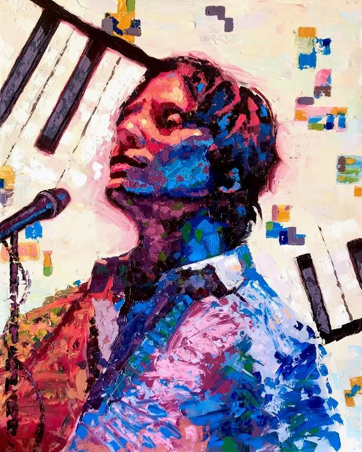
Title: "My Friend John"
24" x 36"
Oil on Canvas
"One of my first paintings introducing Shatter Impressionism"
Red Deer
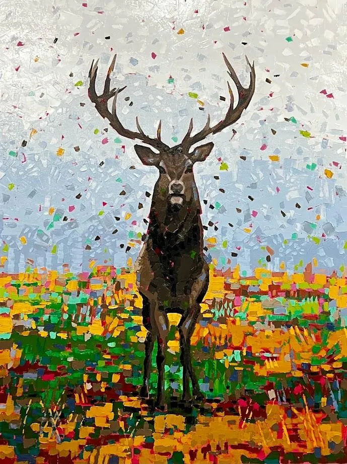
Title: "Red Deer"
36" x 48"
Oil on Canvas
"The bold use of color compliments the neutral background and browns in the deer."
Guardian of the Pass
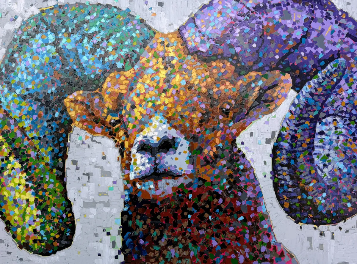
Title: "Guardian of the Pass"
48" x 36"
Oil on Canvas
"It started as a yellow background that I later changed, now I like it much better."
Still have questions?
Contact me!
Connect with us
Instagram. TikTok. YouTube. It’s like a backstage pass, minus the sweaty concert part. Come see what’s cooking in the studio.
Copyright brandonbouck.com All rights reserved.